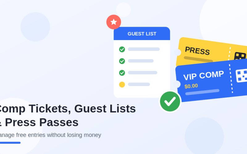
Quick answer
A high-converting event landing page answers five questions fast: what is happening, why it matters, who it is for, when and where it happens, and why the visitor should buy now. The best pages do not simply describe an event. They remove doubt, build desire, and make buying a ticket feel obvious.
- Show the value of the event before asking people to buy.
- Make the date, location, price, and ticket options impossible to miss.
- Use proof, urgency, and a simple checkout path to turn interest into ticket sales.
Most event landing pages do not fail because the event is bad. They fail because the page asks visitors to work too hard. The headline is vague, the value is buried, the schedule is confusing, the ticket options are unclear, and the buy button appears after too much scrolling.
A strong event landing page does the opposite. It gives people confidence quickly. It shows the promise, the proof, the practical details, and the next step without making the buyer hunt for information.
If you are already working on your ticket sales strategy, pair this guide with our articles on how to sell more event tickets and event ticket pricing strategy. Pricing creates the offer. The landing page turns that offer into action.
Why Event Landing Pages Matter More Than Ever
People do not browse event pages patiently anymore. They scan. They compare. They check the date, price, location, speakers, lineup, reviews, refund policy, and checkout experience in seconds. If the page feels unclear, they leave.
That is why an event landing page is not just a design asset. It is a sales system. It has one job: move the visitor from curiosity to confidence.
A good event page does not shout “buy now” louder. It makes the decision feel safer, clearer, and more urgent.
This matters even more when you sell tickets on your own site instead of sending buyers to a marketplace. You control the story, the data, the checkout, and the relationship. If you use WordPress and WooCommerce, our guide on selling event tickets with WooCommerce without marketplace fees explains why that control is valuable.
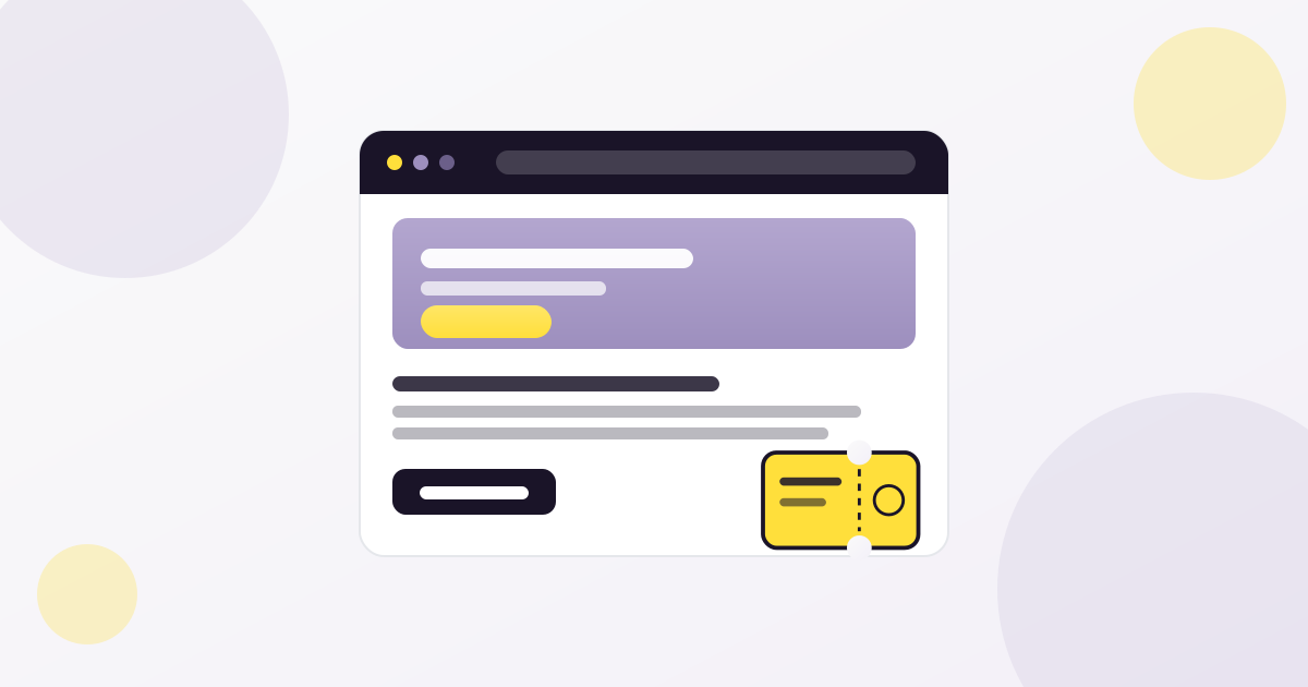
What to Put Above the Fold
The top section of your event landing page should answer the buyer’s most important questions before they scroll.
| Element | What it should do | Bad version | Better version |
| Headline | Explain the core promise | Annual Business Summit | A one-day summit for founders who want better leads, sharper systems, and stronger partnerships |
| Subheadline | Clarify who it is for | Join us this June | For event professionals, venue owners, and marketing teams planning growth in 2026 |
| Date and location | Remove logistical doubt | Coming soon | June 18, 2026 · Austin, TX · Online replay included |
| Primary CTA | Make the next step obvious | Learn more | Get your ticket |
| Trust signal | Reduce risk | None | Hosted by 40+ industry speakers, 1,200 attendees expected |
Do not make people scroll just to understand the event. If the visitor cannot explain what your event is after five seconds, the page is already leaking sales.
The Ideal Event Landing Page Structure
A high-converting event page needs order. Random sections create random decisions. Use a structure that follows the buyer’s natural questions.
- Hero section with headline, date, location, and CTA
- Short value proposition: why this event matters now
- Who the event is for
- Speaker, lineup, agenda, or experience highlights
- Ticket options and pricing
- Social proof: testimonials, past numbers, logos, photos
- Practical details: venue, parking, access, schedule, refund policy
- FAQ section
- Final CTA
This structure works because it follows the mental journey of a buyer: “What is this?” → “Is it for me?” → “Is it worth it?” → “Can I trust it?” → “What do I do next?”
Write a Headline That Sells the Outcome
The headline is not the place to be clever at the expense of clarity. It should tell the right people why they should care.
Headline formulas that work
- For audience + desired outcome: “A practical conference for event organizers who want to sell more tickets without marketplace fees.”
- Problem + solution: “Stop guessing your ticket sales strategy. Build an event growth system that works before doors open.”
- Specific promise: “One day. Twelve sessions. A complete playbook for selling, checking in, and retaining attendees.”
Avoid headlines that only state the event name. Unless your brand is already famous, the event name alone does not communicate value.
Make the Ticket Section Impossible to Misunderstand
The ticket section is where attention turns into revenue. It should be visually clear, emotionally reassuring, and technically simple.
| Ticket section element | Why it matters |
| Ticket type names | Buyers need to know which option fits them |
| What each ticket includes | Value must be visible before checkout |
| Price and deadline | Urgency must feel real, not manipulative |
| Availability | Limited inventory can increase action when it is honest |
| Fees and taxes | Surprise costs at checkout reduce trust |
| Refund or transfer note | Risk reduction helps hesitant buyers |
If you use tiered pricing, explain why prices change. For example: “Early bird pricing rewards early commitment and ends Friday.” That feels fair. A random discount code two days before the event does not.
For more on building ticket tiers, read our guide to event ticket pricing strategy.
Use Proof Before People Ask for It
Visitors look for reasons to trust you. If they cannot find them, they create reasons to delay.
Add proof throughout the page, not only at the bottom. Useful trust signals include:
- Photos from past events
- Speaker or performer credentials
- Sponsor and partner logos
- Attendee testimonials
- Press mentions
- Past attendance numbers
- Clear refund or transfer policy
- Secure checkout messaging
- Real contact information
- Venue details and map
If your event has sold out before, say so. If your event is new, use other proof: organizer experience, partner credibility, community support, or a strong speaker lineup.
The emotional side matters too. Our article on the silent pressure behind a sold out event explores why “sold out” is not just a badge, but a signal that shapes confidence and momentum.
Design for Mobile First
A large part of event discovery happens on mobile: social ads, email clicks, WhatsApp shares, Instagram bios, QR codes, and Google search. If your event page is only beautiful on desktop, it is not finished.
Mobile conversion checklist
- Headline visible without awkward line breaks
- Date, location, and price visible quickly
- Sticky or repeated CTA available after key sections
- Ticket cards easy to compare
- Forms short and thumb-friendly
- No layout shift while images load
- Fast page speed on 4G
- Payment options work smoothly on mobile
Google’s guidance on Core Web Vitals is worth reviewing because slow, unstable pages can hurt both user experience and organic performance.
SEO Elements Every Event Landing Page Needs
SEO for event pages is not about stuffing keywords. It is about making the page easy for both people and search engines to understand.
| SEO element | Best practice |
| Title tag | Include event type, location or year, and main value |
| Meta description | Summarize who it is for, what they get, and why to register |
| H1 | Use one clear headline that matches search intent |
| URL slug | Keep it short and descriptive |
| Internal links | Link to pricing, ticketing, check-in, and related guides |
| Image alt text | Describe the real image and event context |
| Schema markup | Use Event schema where applicable |
| FAQ section | Answer real buyer questions before checkout |
For event-specific search enhancements, review Google Search Central’s Event structured data documentation. If your event includes ticket offers, Google’s Product structured data documentation is also useful for understanding price and availability signals.
You should also connect landing page performance to analytics. Google’s GA4 ecommerce measurement documentation explains how purchase and checkout events can be tracked.
Reduce Checkout Friction Before It Costs You Sales
A great event page can still fail if checkout feels confusing. By the time someone clicks “Get tickets”, momentum is high. Do not slow them down.
- Do not ask for unnecessary fields
- Make ticket quantity easy to adjust
- Show total cost before payment
- Send confirmation emails immediately
- Make tickets easy to download or store
- Give clear instructions for check-in
- Test the full flow before launch
The door experience is part of the promise too. A buyer who gets a ticket quickly but waits in a chaotic line will remember the chaos. Read our guide on ticket check-in at the door before your event goes live.
Common Event Landing Page Mistakes
- Putting the event name in the headline without explaining the value
- Hiding the date, location, or ticket price
- Using too many CTAs with different goals
- Making visitors scroll too far before seeing ticket options
- Using speaker photos without explaining why they matter
- Adding testimonials that sound generic
- Forgetting mobile layout and page speed
- Sending traffic to a page with unclear checkout steps
- Not answering refund, transfer, parking, or access questions
- Publishing the page and never improving it based on data
If your page is getting traffic but not sales, do not immediately blame the price. The issue may be clarity, trust, page speed, ticket structure, or checkout friction.
Event Landing Page Checklist
- The hero section explains the event in five seconds
- The primary CTA is visible early and repeated naturally
- Date, time, location, and format are clear
- Ticket types are easy to compare
- Pricing deadlines are honest and visible
- The page includes proof: photos, testimonials, logos, numbers, or credentials
- The FAQ answers real buying objections
- The checkout path has been tested on mobile
- The page links to relevant supporting content
- Analytics and conversion tracking are in place
- Images are optimized and have useful alt text
- Event schema is added when applicable
Example: A Better Event Page Flow
Here is a simple flow you can adapt for almost any event:
| Section | Purpose |
| Hero | Tell people what the event is and why it matters |
| Value proposition | Explain the transformation or benefit |
| Who it is for | Help the right people self-identify |
| Agenda or highlights | Show substance, not just hype |
| Tickets | Make buying clear and low-friction |
| Social proof | Reduce risk and build confidence |
| FAQ | Remove last objections |
| Final CTA | Give one clear next step |
Simple does not mean boring. It means every section earns its place.
Recommended next read
Once the landing page is clear, improve the full sales system: pricing, email timing, checkout, remarketing, and post-purchase communication.
Final Thoughts
A brutal event landing page is not brutal because it is loud. It is brutal because it is clear. It removes excuses. It makes the value obvious. It makes the next step easy.
Start with the buyer’s questions. Answer them in the right order. Show proof early. Make tickets easy to compare. Keep checkout clean. Track what happens. Improve the page before traffic gets expensive.
Your event does not need a prettier brochure. It needs a page that sells the experience before the first attendee walks through the door.
FAQ
What is an event landing page?
An event landing page is a dedicated page designed to explain an event and convert visitors into registrants or ticket buyers. It usually includes the event promise, date, location, agenda, ticket options, trust signals, FAQ, and a clear call to action.
What should be above the fold on an event page?
The top section should include a clear headline, short value proposition, date, location, primary call to action, and at least one trust signal such as speaker credibility, attendee numbers, partner logos, or past event proof.
How do I make my event landing page convert better?
Improve clarity first. Make the offer obvious, show ticket options early, add proof, answer common objections, optimize for mobile, reduce checkout steps, and use analytics to identify where people drop off.
Should an event landing page include FAQ schema?
If the page includes a real FAQ section with visible questions and answers, FAQ schema can help search engines understand the content. It should accurately match the visible page content.
How many CTAs should an event landing page have?
You can repeat the same primary CTA several times, but avoid competing CTAs. For most ticketed events, the main action should be something like “Get tickets” or “Register now”.